Welcome
This is the 'out-of-the-box' style guide generated from the
living-styleguide-skeleton project.
Table of contents
Introduction
A living style guide is a reference, used as a single source of truth, that can help create a shared understanding of how the visual design of an application should look and feel, and provide guidance on how its user interface may be realized.
The living-styleguide-skeleton is an opinionated project scaffold used for
developing a CSS stylesheet in isolation, and at the same time, creating a
companion style guide.
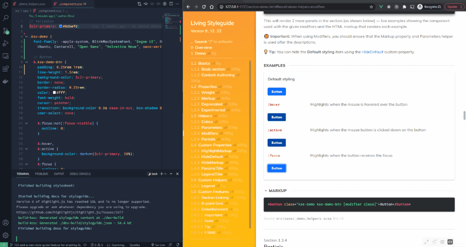
SASS is used for CSS preprocessing, and KSS is adopted as the approach for documentation and generation of style guide content. More information regarding the use of KSS is detailed in the Documentation Guide section.
The tooling includes a dev server that enables both the stylesheet and style guide to be developed side-by-side.
Motivation
Developing the proper documentation for the stylesheet is a non-trivial and often, separate endeavor from the development of the stylesheet itself.
The living-styleguide-skeleton aims to make CSS development and documentation
seamless, by combining the development of stylesheet and style guide into an
integrated process.
Developing CSS is typically done in tandem with a visual sample where there is some given HTML markup that requires styling. The most basic approach to this is to first conceive the HTML markup that best represents the UI component, and then adding the necessary CSS to style into its desired form. Finally, visual affirmation is conducted to ensure that the styling appears as intended.
The following contrived example is meant to illustrate the above idea, in the
context of living-styleguide-skeleton.
Start example
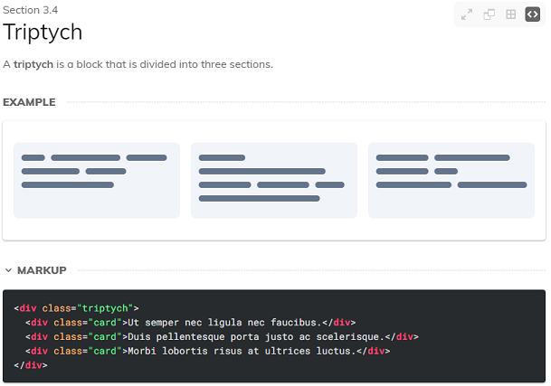
A UI component, Triptych, needs to be developed and uses the CSS selector
class, triptych.
An unstyled visual sample can be rendered onto the style guide, by creating a new style guide section and including the necessary HTML markup that represents the underlying structure of the component.
// Triptych
//
// A __triptych__ is a block that is divided into three sections.
//
// Markup:
// <div class="triptych">
//  <div class="card">Ut semper nec ligula nec faucibus.</div>
//  <div class="card">Duis pellentesque porta justo ac scelerisque.</div>
//  <div class="card">Morbi lobortis risus at ultrices luctus.</div>
// </div>
//
// Styleguide Layouts.Triptych

.triptych {
  // add the styles to achieve end result
}
The rendered sample appears unstyled initially, and CSS is then added to shape the component into its intended form. The sample constantly reflects the effect of the CSS code as it is being developed, serving as visual guidance. And eventually, the finished result may look like the following.
Although the process in the example is the same as the basic CSS development process, there are a couple of differences:
-
At no point was creating a separate markup file necessary for "visually testing" the written CSS code. Instead, the visual sample above was produced from in-source comments where the CSS was authored.
-
Other than having produced the CSS code for the UI component, the documentation for it was also created.
-
Unlike a process where styling is done on a product that is undergoing development; here, the process of styling is conducted away from the product, i.e. in isolation.
End example
Although CSS is the oft-mentioned term in living-styleguide-skeleton, the gist
of the project is more about the documentation than it is about the stylesheet.
The reason being, the effort required to develop a stylesheet is often
relatively small, as compared to that needed to produce materials for
communicating about its usage — not to mention, keeping both in sync.
In order to support the various types of documentation needed for communicating
about design, a majority of the development of living-styleguide-skeleton is
devoted to expanding and improving upon the authoring capabilities that
kss-node provides.
Enhancing style guide user features and optimizing its display and performance
is also a key focus.
Getting Started
📝 Note: The repository of the project is currently private.
Initializing the project
# navigate into the project folder
cd /path/to/my-project

# install project dependencies
npm install
Running the development environment
# start dev environment
npm run dev
The dev environment will spin up a webserver to serve a live copy of the style guide, and a background process for watching file changes.
Building the static style guide and distributable for deployment
# build static style guide and distributable
npm run build
This generates a static style guide and any distributable files (i.e. assets and
.css that are associated with the stylesheet).
The built style guide and distributable files will be located in
build/styleguide and build/dist respectively.
💡 Tip: If using Bitbucket, GitLab, or GitHub for version control, a service like Netlify can be used to automate the publishing of the style guide every time changes are pushed into the repo.
Running live testing mode
# build a production copy and serve on target browser(s)
npm run live-test
Live testing is a convenient way to sample the production copy of the style guide across multiple browsers and also allows for interactions with the style guide to be synced.
The choice of browser(s) to launch can be configured in styleguide.config.js.
// ## styleguide.config.js
const config = {
  ...,
  webServer: {
    port: HTTP_PORT,
    browser: [
      "chrome",
      // "firefox",
      // `microsoft-edge:http://localhost:${HTTP_PORT}`,
    ],
  },
  ...,
}

module.exports = config
Key Packages Used
The project currently uses the following tools in order to accomplish its purpose.
- kss-node - KSS parsing and style guide generation.
- sass - CSS preprocessing, supporting modern SASS features like
@use,@forwardand namespacing. - postcss - CSS postprocessing, like auto prefixing (via autoprefixer) and minification (via cssnano).
- chokidar - Watching changes in the file system and running appropriate build processes in response.
- live-server - Web server used to serve the style guide during development.
- BrowserSync - Web server used to serve the style guide for production preview, allowing interactions to be synced across instances.
- esbuild - JS bundling for scripts used in the style guide which supports compiling of Vue SFCs using a self-made plugin.
- Vue 3 - For making certain style guide features like search functionality.
Usage Notes
General Use Case
The living-styleguide-skeleton is generally suited for a CSS developer who
wants to quickly produce documentation for a stylesheet and does not want to
fuss with complex initial setups.
Due to current limitations, it is not suitable if the following are considered important:
-
To be able to serve the style guide on the public domain with SEO on a per-page basis.
-
To be able to integrate into an existing project.
Describing Component Behavior
Although unorthodox, behaviors of a component may be provided using Gherkin to elaborate on behavioral requirements as follows.
A Gherkin code block in markdown can be rendered with ```gherkin (three
backticks).
Component: Accordion
  Scenario: ...
    When the User ...
    Then the Accordion should ...
Because a UI component may be re-implemented by different teams that use a different frontend stack, taking the time to assert component behavior can help implementers (and testers alike) to get a clearer idea of how it functions — especially if the style guide is only concerned with the styling aspect.
Import an existing CSS library
Using SASS, you can import a SASS-based library like Bootstrap to use as a starting point and then build on top of it.
// main.scss
@import "bootstrap/scss/boostrap";

// Note: "node_modules" is already set as an included path
// in SASS compiler, so it can be omitted.
💡 Tip: The example imports the whole of Bootstrap but you can choose to import only the stuff you need.
Using as a resource library
The scaffold is purposed for collecting all static media assets (e.g. images, fonts, etc) — including the CSS itself — into a single static resource library. This means that it was intended to be fashioned into a package, so that it may be included in other projects as a dependency. In this way, the collection of assets can be made available to multiple consumers (i.e. other projects) in the form of a global resource collection.
Therefore, it is recommended to use Git as version control to enable
future options like installing a Git repo as dependency via npm.
# install from cli
npm i https://gitlab.com/your_username/your_repo_name.git#tag_name
Or you can do this from package.json and running npm install.
// package.json
{
  ...
  "dependencies": {
    ...
    "your_repo_name": "https://gitlab.com/your_username/your_repo_name.git#tag_name"
  }
  ...
}
You can then import the styles into your project.
// ## your_project_main.scss
@import "path/to/node_modules/your_repo_name/src/sass/main";
File Structure
This section assumes that my-project is the root directory of the scaffold.
📁 my-project
├── 📁 config
│   ├── 📄 esbuild.config.js
│   ├── 📄 postcss.config.js
│   └── 📄 styleguide.config.js
├── 📁 scripts
├── 📁 src
│   ├── 📁 assets
│   ├── 📁 sass
│   │   └── 📄 main.scss
│   └── 📁 styleguide
│       ├── 📁 extend
│       ├── 📁 js
│       │   └── 📄 main.js
│       ├── 📁 styles
│       │   └── 📄 kss.scss
│       ├── 📁 template
│       │   ├── 📁 kss-assets
│       │   ├── 📄 builder.js
│       │   └── 📄 index.hbs
│       │   └── 📄 package.json
│       └── 📄 overview.md
├── 📄 .browserslistrc
└── 📄 package.json
Build scripts
📁 scripts
- Scripts for toolchain operations.
Static Resources
📁 src/assets/
- Static media assets like images, fonts, etc.
📁 src/sass/
- SASS source files of the stylesheet.
- 📄
main.scssis the default entry file.
Style guide
📁 src/styleguide/
- Source files related to the generation of style guide artifacts.
- 📄
overview.mdcontains the contents of the style guide front page.
📁 src/styleguide/extend/
- Source files related to extending style guide generation using Handlebars partials.
📁 src/styleguide/js/
- Client-sided JS scripts used in the style guide, bundled using
esbuild. - 📄
main.jsis the entry file.
📁 src/styleguide/styles/
- SASS source files of the style guide.
- 📄
kss.scssis the entry file.
📁 src/styleguide/template/
- Source files used to generate style guide content and structure.
- 📄
builder.jsis a builder script is used to overridekss-nodebase builder. - 📄
index.hbsis a Handlebars template is used to generate the.htmlfile(s) in the style guide. - 📄
package.jsonis required forbuilder.jsto take effect. Do not remove!
📁 src/styleguide/template/kss-assets/
- Static assets used in the style guide.
Configuration
📁 config
- 📄
esbuild.config.jsis the esbuild configuration. - 📄
postcss.config.jsis the PostCSS configuration. - 📄
styleguide.config.jsis theliving-styleguide-skeletonconfiguration which can be overridden by creating astyleguide.config.jsat the project root.
📄 .browserslistrc
- Browserslist config file to define range of browser support.
- Used by Autoprefixer to determine what to autoprefix.
📄 package.json
- The project's
package.jsonfile.